A monograph · 2016—2026 Vol. 01 — Brand & Graphic Design

VERA KOHL

Brand & graphic designer — making marks, systems and stories that hold their ground.

Selected work · logo systems · packaging · posters · type design

Specimen 01 — Voss Grotesk · 9pt/13 · riso ink on paper

Scroll to read ↓

Good design is opinionated. It takes a side, sets the tone, and refuses to whisper. This monograph collects ten years of taking sides — in ink, paper and light.

01Logo system

ATLAS BREWING CO. · 2021

A mark
that holds.

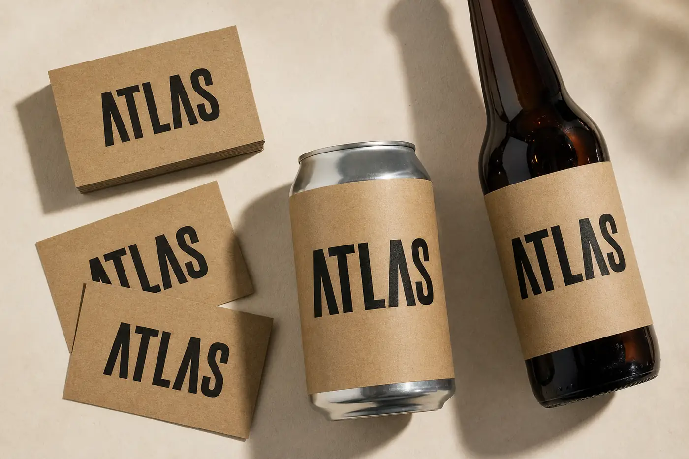
Atlas needed a system, not a logo: a wordmark that survives a can, a tap handle and a truck. The answer was geometry — a compass-set A that locks into a grid and never blurs.

The identity lives as a construction kit: one mark, three lockups, infinite colorways. It builds itself in front of you — the logo literally assembles on scroll.
  • Identity
  • Wordmark
  • Packaging
  • Art direction
ATLAS brewery identity system on kraft paper: cards, can and label
The mark assembles on scroll — stroke by stroke.
Palette / film strip — drag to scrub
#16130F

02Packaging

BOTANIC LAB · 2023

Quiet
on the shelf.

A skincare line that refuses to shout. Botanic Lab's packaging is a study in restraint — three tones, one typeface, a grid you could set your watch to.

Every box is a leaf in a system: the botanical mark rotates into place as you unbox, a small ritual that turns routine into ceremony.

  • Packaging
  • Editorial grid
  • Production
Botanic Lab skincare packaging in sage green and cream arranged in a grid
The leaf rotates into place as it enters view.
Palette / film strip — drag to scrub
#2F5E4C
03Posters

NOISE / SILENCE · 2024

Loud
enough to read.

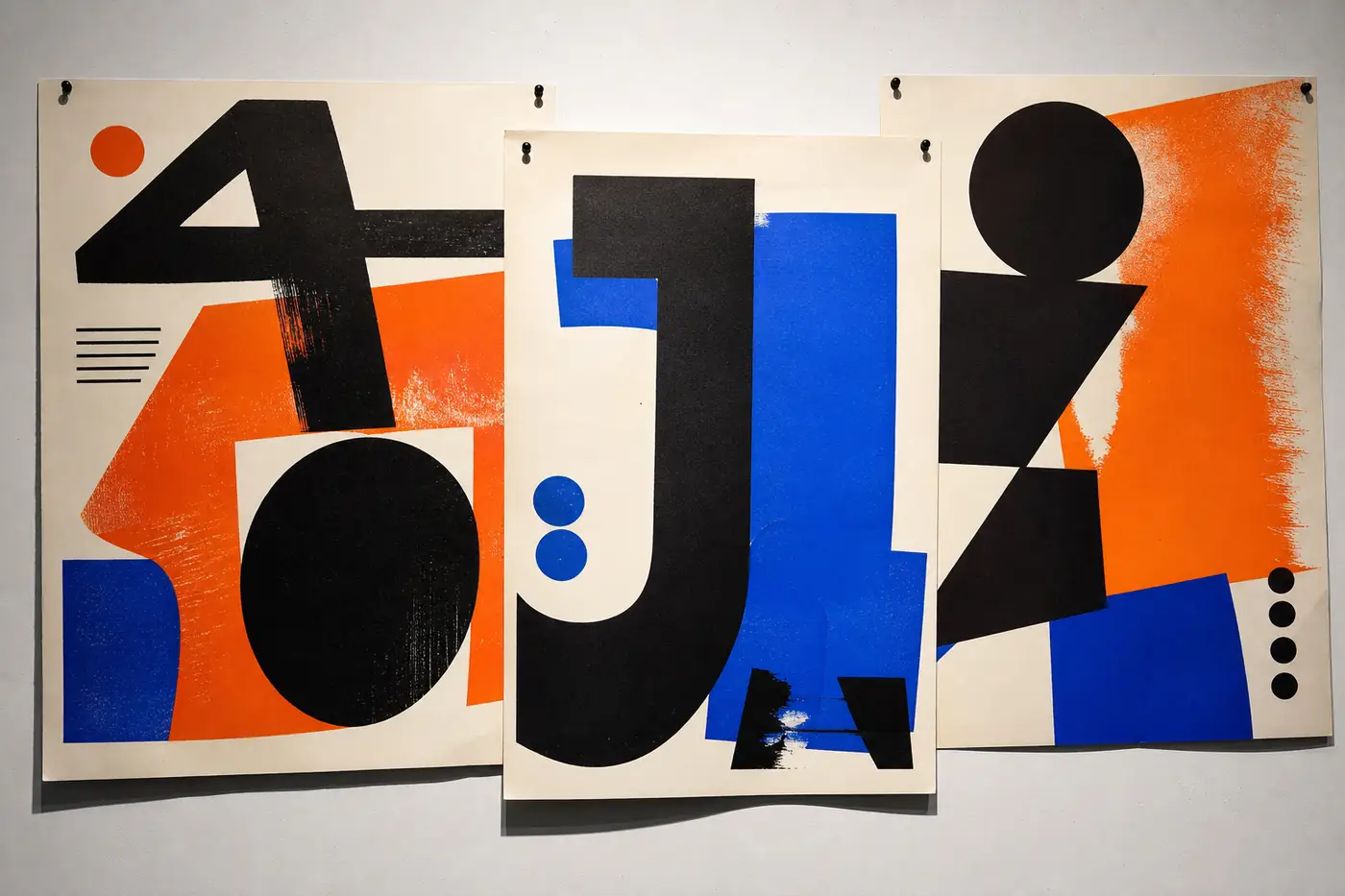
A jazz festival poster series built from one rule: the type is the music. Oversized letterforms carry the tempo; color carries the mood.

Three posters, three movements — loud, quiet, loud again. Printed risograph, one pass per color, ink hitting paper like a cymbal.

  • Poster
  • Risograph
  • Typography
Three jazz festival posters with oversized typography pinned to a wall
Three movements — loud, quiet, loud again.
Palette / film strip — drag to scrub
#16130F
04Type design

MONO GROTESK · 2025

A face
for the machine.

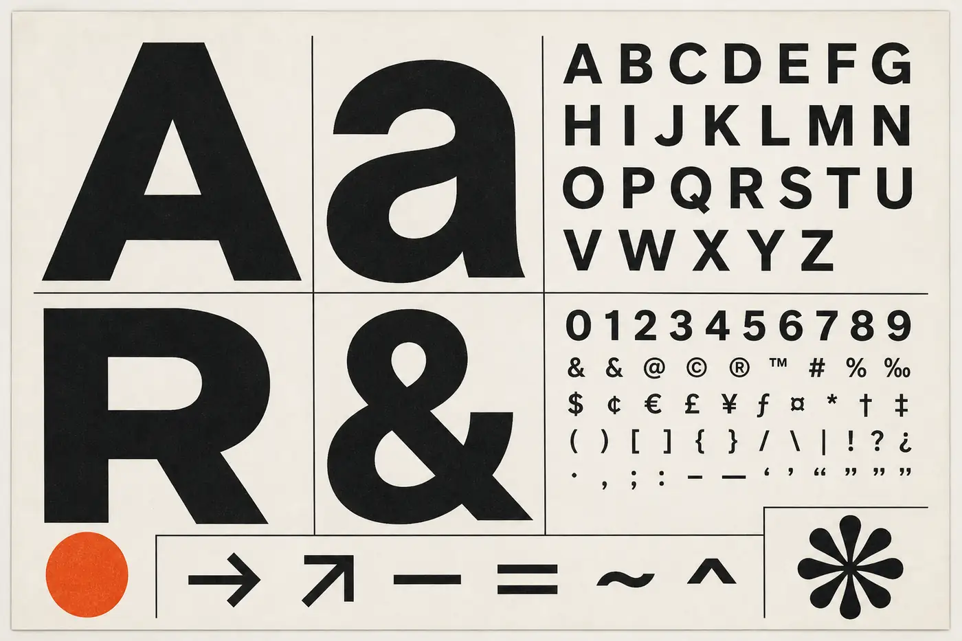
Mono Grotesk is a monospaced grotesk built for interfaces with a pulse. It started as a terminal face and grew into a full family — four weights, italics, and a full character set.

Every glyph shares the same width, but none of them whisper. It is the typeface this monograph is set in.

  • Type design
  • Specimen
  • Open-source
Mono Grotesk type specimen sheet with oversized glyphs
AaBbCc 0123456789 The quick brown fox jumps over the lazy dog. Light 400 Medium 500 Bold 700
Palette / film strip — drag to scrub
#16130F
Type specimens

Take the type home.

Three working faces from the practice. Drag the cards around the stage; resize with the slider (or pinch on touch). Specimens download as PDF.

Mono Grotesk — 400

The quick brown fox jumps over the lazy dog — 0123456789

Regular · 400 · terminal grotesk

Kohl Serif — Italic

Opinionated by design, legible by discipline.

Italic · editorial serif

Kohl Display — 700

LOUD · CLEAR · TRUE

Bold · 700 · poster scale

Lectures & talks

On record,
on stage.

On type & attitude — a talk on design (video)

2025 · Rotterdam

Type & Attitude

A keynote on why typography is never neutral — and how designers can take sides without losing their seat.

2024 · São Paulo

Systems, not Logos

On building identities that survive a decade — grids, rules and the courage to repeat yourself.

2023 · Vienna

The Quiet Shelf

Packaging as restraint: why the loudest product on the shelf is often the quietest one.

Contact

Have a mark
in mind?

[email protected]
Rotterdam / remote worldwide Booking 2026 — open Instagram · Are.na